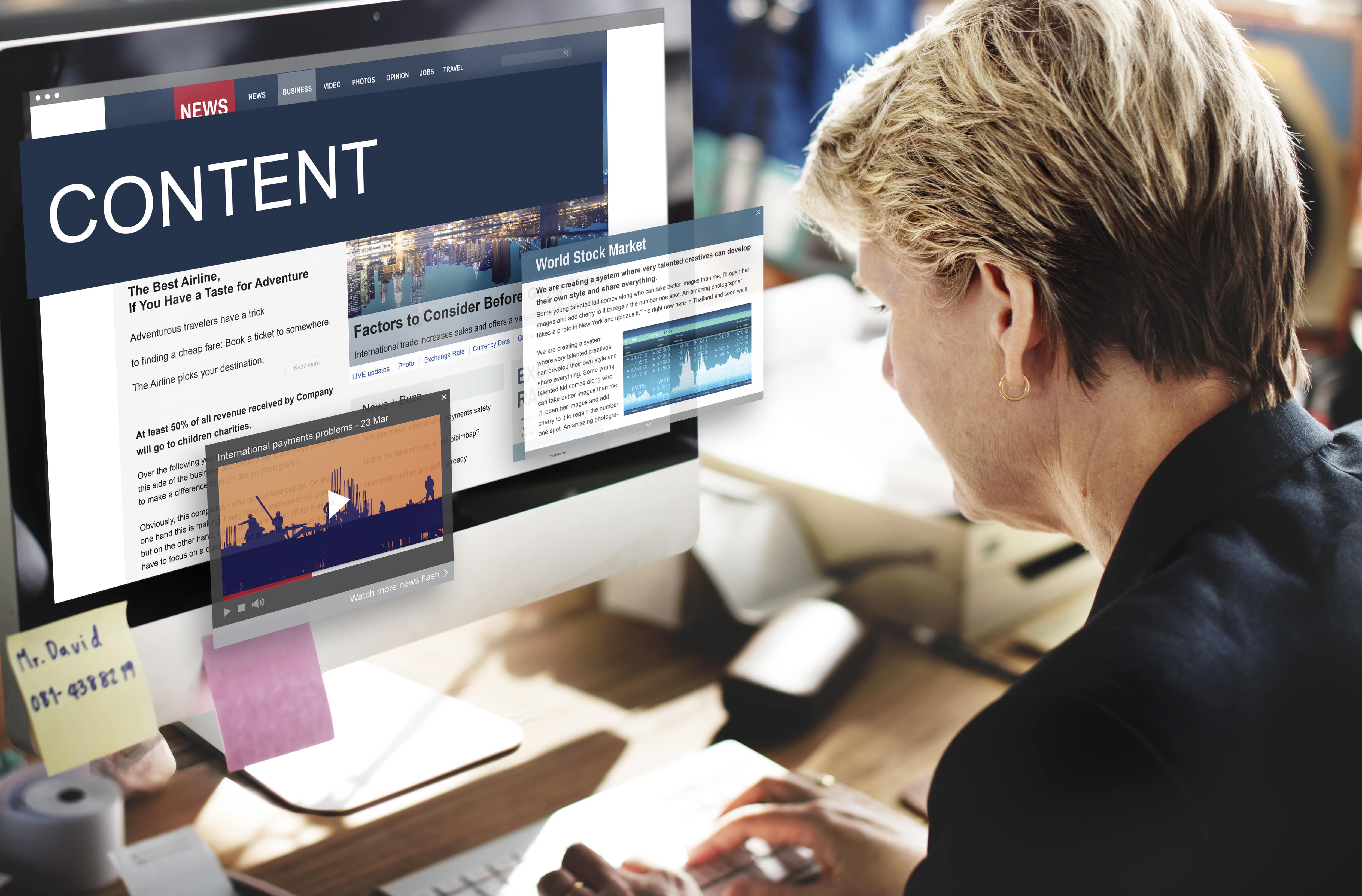
Accessibility reaches much beyond your website's colour style and coding. All elements of your website are subject
to accessibility, including the most crucial component: your content. Employing best practices for usability may
enhance your website in multiple ways. For example, it may boost your SEO ranking and eliminate obstructions for
your visitors.
With these useful suggestions, producing new material or making existing contents more accessible will be less
difficult.
1. Titles and headings
-
Page titles must to be distinctive and crucial:
- The primary subject of the page needs to be its title.
- It is never appropriate for two pages to have the same title. Make use of concise, evocative page titles:
- The goal of the page needs to be obvious in the title.
- The visitor to a website is helped by the page names.
- Both the sitemap and search results display the titles of the pages. Users should be able to locate the material they're looking for with ease thanks to the page title. Headings can be used to separate content sections:
- Heading styles are in six forms: H1, H2, H3, H4, H5, and H6.
- The headings are arranged in a hierarchical structure with H1 being the most significant and H6 being the least essential.
- There must be a title on each page (H1).
- The number of additional headings on a page is unlimited, but there should only be one H1 per page.
2. Text
-
Make your sentences clear and concise:
- Write as if the reader has only completed nine years of education.
- Write in simple understandable language for a broad audience.
- Remain clear of business-specific terminologies and vocabulary.
- When language relevant to a given industry is required, define the phrases and include context by providing their definitions.
- Explain the meaning of abbreviations.
- In different contexts, the same abbreviation might have different meanings. Provide definitions for acronyms to assist your visitors in understanding their meaning. Deliver specific guidelines:
- Lots of visitors have trouble recognising colour; individuals who are partially sighted, for instance, frequently have impaired colour vision. Links can be distinguished from normal text by adding an underlining, icon, and/or bolding.
- Keep clear guidance like "Click the blue link," which depend solely on colour.
- Don't rely just on colour to communicate information. For instance, in the absence of text labels, a graph including coloured lines might be challenging for a person who is colour blind to comprehend. Sensory components:
- Some visitors have constraints that prevent them from using information about orientation or spatial position, as well as from perceiving size or shape.
- Remain clear of directions that simply take sensory aspects into account, like "Click the round button on the left.
3. Links
-
Link syntax should be unique and clarify the link's purpose:
- Avoid ambiguous links.
- Stay away from using link language like "Read more" or "Learn more." Rather, explain the link's purpose. For example, the phrase "Read more about our services" makes the goal of the link clear.
- Links that share link text must go to the same destination. For example, two links with the text “About Us” must link to the same page.
4. Images
-
Alternative text (also called alt text attribute):
- One or two sentences that adequately describe the image should make up the alternative text.
- Don't use the terms "picture of" or "image of.
- Make use of proper grammar.
- Use of keywords is limited. It's not required to use keywords.
- The information provided by alternative text shouldn't match that of the text next to the image.
- In order for visitors to see the image, screen readers will read the alternative text to them. Give a description of non-text information in text form:
- When creating alternative text, take into account the surrounding text for the image.
- Alternative text is not necessary for ornamental pictures.
- Decorative images serve only as decoration; they are neither functional or informative for the text.
- Add the alternative phrases if you're not sure if a picture is decorative or not.
5. Videos
-
Captions:
- Videos with audio must have captions.
- Some sites, like Vimeo and YouTube, allow you to add closed captions to videos; nevertheless, your team may need to do manual adjustments for them.
- Automatic captioning frequently inserts the incorrect words or skips words. Transcripts:
- In essence, transcripts are the video's script.
- For visitors who for whatever reason are unable to see the video, transcripts offer an alternate written option.
- For viewers who are blind or visually handicapped, transcripts give context for audio-only videos.
- If the surrounding information is a text alternative to the video, then transcripts are not necessary. Descriptions:
- A video's visual content is audibly explained through descriptions.
- For visitors who are
- visually or intellectually challenged, descriptions can offer context. Background audio:
- Speech content shouldn't be impeded by background sounds.
- When someone is speaking, turn down the volume or turn off the background noise.
6. Tables
- Tables must have the relevant ARIA properties available, which can call for help from a web developer.
- When utilising a screen reader, table cells must be read in a logical order. This might be difficult to do and could need help from a web developer.
- All screen widths must be supported by the visual look, which can necessitate more style by a web developer.
- Steer clear of or reduce complexity in tables.
- Complex tables may not be supported by all screen readers.
- There should never be empty table cells.
- Table cells need to be connected to the relevant headers.
- Use the relevant markup to designate a header row.
- Use the relevant markup to designate a header row.
- Use
to indicate header cells and to indicate data cells. - To give additional details about the table, add a caption.
- Visitors can better grasp the table's content by reading the captions.
- To add a caption, use the
element.
7. PDFs and other downloadable content
- Word processing files, PDFs, and other downloaded materials need to be available as well.
- Adobe offers the tools necessary to develop and confirm PDF accessibility. Further details are available here.
- Here is where Microsoft offers guidance on how to make Word documents accessible.
- More details on generating accessible documents via Google Drive may be found here. Additional advice
- Include a statement about accessibility on a page in your website footer to let people know that you value accessibility. To make the process of producing an accessibility statement easier, check out the Site Improve generator.
- Make sure that visitors can read the sitemap on your website.
- To assist visitors, avoid errors, keep forms brief and include guidance.
accessibility into your website if it is big and has lots of pages and post types. To get comfortable with accessibility, start small and apply these recommendations to a single page. Moreover, you may notify users to your website that accessibility is still a work in progress by including an accessibility statement.
Recent News